Hospital Rating Project – The CMS Star Rating Program.
The dataset for this project was from cms data which gives users access to public healthcare data in machine-readable formats.
In the U.S., every hospital that receives payments from Medicare and Medicaid is mandated to provide quality data to The Centers for Medicare and Medicaid Services (CMS) annually. This data helps gauge patient satisfaction levels across the country.
While the quality of customer services can influence overall hospital scores, satisfaction may also vary depending on the type of hospital or its location.
This project examines data from the Years 2016-2020
The goals of this project are:
- The project aims to rank hospitals based on specific metrics and consider how the hospitals have changed or improved in these metrics over the years.
- The project shall also highlight the relevant metrics to guarantee patient satisfaction.
- With the data, I will also highlight areas where the hospital excels or needs improvement.
- Create interactive visuals that correctly represent the important metrics to showcase and rank a hospital’s performance.
- Suggest ways the low-ranking hospitals can improve on the aspects with lapses.
- Work with geographic insights showing regional variations in patient satisfaction to identify states with high and low scores.
- Present my findings through a short, simple, and data-backed presentation.
To Satisfy the project goals, I shall take the project through all six processes of data analysis;
- Ask
- Prepare
- Process
- Analyze
- Share
- Act
Ask Phase
The questions to guide my analysis include:
- What hospitals have excelled at what satisfaction metric over the past 5 years?
- What satisfaction points are geography or specialization-specific?
- How can visualizations/products from my analysis help influence how hospitals operate and can it show what they can do better?
- What sort of data will I be working with and does it best represent my analysis goals?
To answer the above questions, I have come up with the following deliverables for my project:
- The project aims to rank hospitals based on specific metrics and consider how the hospitals have changed or improved in these metrics over the years.
- The project shall also highlight the relevant metrics to guarantee patient satisfaction.
- With the data, I will also consider areas where the hospital excels or needs improvement.
- Create interactive visuals that correctly represent the important metrics to showcase and rank a hospital’s performance.
- Benchmark and compare the hospital’s ratings with the country’s average.
- Suggest ways the low-ranking hospitals can improve on the aspects with lapses.
- Work with geographic insights showing regional variations in patient satisfaction to identify states with high and low scores.
- Present my findings through a short, simple, and data-backed presentation.
Guiding Questions
What Problem Am I trying To Solve
With my project, I aim to give the public an outlet to see how each hospital ranks in specific areas and showcase what the said hospitals can do to improve.
How can my analysis help drive hospital growth?
The provisions my analysis brings can in turn help hospitals improve the services of the hospital and encourage patients to share information more.
What sort of data will I be working with and does it best represent my analysis goals?
The data for the project is from an HCAHPS survey (a data collection method to help patients share their thoughts on diverse aspects of a hospital’s service). – I will share all I have done to demystify and understand the data better in the Prepare Phase.
Key Tasks For This Phase
- Highlight the project questions
- Consider key stakeholders – the hospital management and the general hospital users
- Deliverable – one-line sentence representing the business task.
Prepare Phase
Before analysis and processing, I must demystify the data before me. Since some of the audience of my visualization may be non-medical/hospital-based individuals, it is important I make the columns in the dataset easy to understand.
To aid in better assimilation of my analysis, here is a table showing columns and their interpretation.
| HCAHPS Data | Interpretation | Number of Variables |
| H_CLEAN_HSP_A_P | Percentage of patients who reported that their hospital room and bathroom are always clean. | 1 |
| H_STAR_RATING | Composite score summarizing a hospital’s overall performance expressed as a 1 to 5-star rating. | 1 |
| H_CLEAN_HSP_SN_P | Percentage of patients who reported that their hospital room and bathroom were “Sometimes” or “Never” clean. | 1 |
| H_CLEAN_HSP_U_P | Percentage of patients who reported that their room and bathroom were “Always” clean during their stay. | 1 |
| H_CLEAN_LINEAR_SCORE | Linear mean score reflecting patient responses about the cleanliness of their hospital environment. | 1 |
| H_COMP_1_A_P | Percentage of patients who reported that doctors always listened carefully to them. | 1 |
| H_COMP_1_LINEAR_SCORE | Linear score reflecting patient satisfaction with communication from nurses. | 1 |
| H_COMP_1_SN_P | Percentage of patients who reported that nurses “Sometimes” or “Never” communicated Ill. | 1 |
| H_COMP_1_STAR_RATING | Star rating based on nurse communication quality. | 1 |
| H_COMP_1_U_P | Percentage of patients who reported that nurses “Usually” communicated Ill. | 1 |
| H_COMP_2_A_P | Percentage of patients who reported that doctors “Always” communicated Ill. | 1 |
| H_COMP_2_LINEAR_SCORE | Linear mean score for patient responses to doctor communication questions. | 1 |
| H_COMP_2_SN_P | Percentage of patients who reported that doctors “Sometimes” or “Never” communicated Ill. | 1 |
| H_COMP_2_STAR_RATING | Star rating based on doctor communication quality. | 1 |
| H_COMP_2_U_P | Percentage of patients who reported that doctors “Usually” communicated Ill. | 1 |
| H_COMP_3_A_P | Percentage of patients who reported that they “Always” received help as soon as they wanted. | 1 |
| H_COMP_3_LINEAR_SCORE | Linear mean score rating the responsiveness of hospital staff. | 1 |
| H_COMP_3_SN_P | Percentage of patients who reported that they “Sometimes” or “Never” received help as soon as they wanted. | 1 |
| H_COMP_3_STAR_RATING | Star rating based on staff responsiveness. | 1 |
| H_COMP_3_U_P | Percentage of patients who reported that they “Usually” received help as soon as they wanted. | 1 |
| H_COMP_4_A_P | Percentage of patients who reported that their pain was “Always” Ill controlled. | 1 |
| H_COMP_4_LINEAR_SCORE | Linear mean score for pain management effectiveness. | 1 |
| H_COMP_4_SN_P | Percentage of patients who reported that their pain was “Sometimes” or “Never” Ill controlled. | 1 |
| H_COMP_4_STAR_RATING | Star rating based on pain management effectiveness. | 1 |
| H_COMP_4_U_P | Percentage of patients who reported that their pain was “Usually” Ill controlled. | 1 |
| H_COMP_5_A_P | Percentage of patients who reported that staff “Always” explained about medicines before giving them. | 1 |
| H_COMP_5_LINEAR_SCORE | Linear mean score for communication about medicines. | 1 |
| H_COMP_5_SN_P | Percentage of patients who reported that staff “Sometimes” or “Never” explained about medicines before giving them. | 1 |
| H_COMP_5_STAR_RATING | Star rating based on communication about medicines. | 1 |
| H_COMP_5_U_P | Percentage of patients who reported that staff “Usually” explained about medicines before giving them. | 1 |
| H_COMP_6_LINEAR_SCORE | Linear mean score for discharge information effectiveness. | 1 |
| H_COMP_6_N_P | Percentage of patients who reported that they’re not given information about what to do during recovery at home. | 1 |
| H_COMP_6_STAR_RATING | Star rating based on discharge information effectiveness. | 1 |
| H_COMP_6_Y_P | Percentage of patients who reported that they’re given information about what to do during recovery at home. | 1 |
| H_COMP_7_A | Percentage of patients who agreed they understood their care when they left the hospital. | 1 |
| H_COMP_7_D_SD | Percentage of patients who disagreed or strongly disagreed that they understood their care when they left the hospital. | 1 |
| H_COMP_7_LINEAR_SCORE | Linear mean score for care transition understanding. | 1 |
| H_COMP_7_SA | Percentage of patients who strongly agreed they understood their care when they left the hospital. | 1 |
| H_COMP_7_STAR_RATING | Star rating based on care transition understanding. | 1 |
| H_HSP_RATING_0_6 | Percentage of patients who rated the hospital 6 or less on a scale from 0 to 10. | 1 |
| H_HSP_RATING_7_8 | Percentage of patients who rated the hospital 7 or 8 on a scale from 0 to 10. | 1 |
| H_HSP_RATING_9_10 | Percentage of patients who rated the hospital 9 or 10 on a scale from 0 to 10. | 1 |
| H_HSP_RATING_LINEAR_SCORE | Linear mean score for overall hospital rating. | 1 |
| H_HSP_RATING_STAR_RATING | Star rating based on overall hospital rating. | 1 |
| H_QUIET_HSP_A_P | Percentage of patients who reported that the area around their room was always quiet at night. | 1 |
| H_QUIET_HSP_SN_P | Percentage of patients who reported that the area around their room was sometimes or never quiet at night. | 1 |
| H_QUIET_HSP_U_P | Percentage of patients who reported that the area around their room was usually quiet at night. | 1 |
| H_QUIET_LINEAR_SCORE | Linear mean score for the quietness of the hospital environment at night. | 1 |
| H_QUIET_STAR_RATING | Star rating based on the quietness of the hospital environment at night. | 1 |
| H_RECMND_DN | Percentage of patients who would probably or not recommend the hospital. | 1 |
| H_RECMND_DY | Percentage of patients who would recommend the hospital. | 1 |
| H_RECMND_LINEAR_SCORE | The linear mean score for the likelihood of recommending the hospital. | 1 |
| H_RECMND_PY | Percentage of patients who would probably recommend the hospital. | 1 |
| H_RECMND_STAR_RATING | The star rating is based on the likelihood of recommending the hospital. | 1 |
| H_STAR_RATING | Summary star rating reflecting overall hospital performance across multiple measures. | 1 |
The Excel dataset contains way more than what the table above shows but the columns I’ve chosen are best to demonstrate the ratings of each hospital across multiple aspects.
The initial column count was 43 but has been reduced to 24 columns for efficient data processing.
While the hospital data has been collected by a high-standard organization, I still need to be certain of the data quality. Below are some questions I would have asked to this effect:
- Why do some hospitals generate more data rows than others?
- Did users contribute data at their convenience or were they told how often and when to contribute the data?
- Are there measures that have been taken to remove sampling bias during data collection?
- Is it possible to obtain the new version of these datasets dataset?
- How involved are the hospitals in the data collection process?
Process Phase
Data Cleaning and Processing
During the cleaning process, I shall focus on ensuring data integrity and highlight some risks that may arise if I don’t maintain this integrity. Since I do not communicate directly with stakeholders in this hypothetical case study, I will have to trust that the data provider has done their best to remove any bias during the data collection.
For the case study analysis, the following columns have been selected:
- Facility ID
- Facility Name
- Address
- City
- State
- ZIP Code
- County Name
- Phone Number
- HCAHPS Measure ID
- HCAHPS Question
- HCAHPS Answer Description
- Patient Survey Star Rating
- Patient Survey Star Rating Footnote
- HCAHPS AnsIr Percent
- HCAHPS AnsIr Percent Footnote
- HCAHPS Linear Mean Value
- Number of Completed Surveys
- Number of Completed Surveys Footnote
- Survey Response Rate Percent
- Survey Response Rate Percent Footnote
- Start Date
- End Date
- Year
- Hospital Type
- Hospital Ownership
- Emergency Services
- Meets criteria for promoting interoperability of EHRs
- Hospital overall rating
- Hospital overall rating footnote
- Mortality national comparison
- Mortality National Comparison footnote
- Safety of Care National comparison
- Safety of Care national comparison footnote
- Readmission national comparison
- Readmission national comparison footnote
- Patient experience national comparison
- Patient experience national comparison footnote
- Effectiveness of Care National comparison
- Effectiveness of care national comparison footnote
- Timeliness of care national comparison
- Timeliness of care national comparison footnote
- Efficient use of medical imaging national comparison
- Efficient use of medical imaging national comparison footnote
To begin the data preparation process, here are a few tasks I’ll perform with Microsoft Excel:
- Change the data type for specified columns
- Quality control – remove blank spaces for columns
- Use filters to check the validity of column data
Below, I’ll provide you with a high-level description of the steps I have taken to ensure data integrity and fulfill the data demands of my project. The data processing steps I have taken are listed but not limited to the below:
Alignment with the objects (Union)
Since I have datasets from 5 years, and contain over 46 columns, I must optimize the columns to ensure I do not miss out on relevant insights – which will be relevant to fulfilling our analysis needs. After concluding this separation, I shall then union all 5 years’ worth of data into a single table.
Below is a breakdown of the MySQL process for cleaning and merging the data
Insert SQL insert and Union query.
Dropping Columns
Some datasets have columns that are irrelevant to what my analysis is trying to pursue. As with many analyses, some variables are not contextual to my analysis needs as Ill. Also, some data does not contain valid information. For example, the LoggedActivitiesDistance has a series of numbers that are pretty inconsistent and hard to understand.
Columns like this are difficult to explain in the context of the project and need to be dropped from the datasets – most of the columns I have removed from the dataset either deliver very little context for understanding them (the national average ones) or cannot be factored into the general dataset quantifiably.
Managing Outliers
I have to include columns with missing values and proceed with the analysis for the users who did not contribute data for the fields. Still working with missing values can help us identify ways to improve our data collection.
There is also no way to fill in missing values but in the coming parts, I will recommend some ways to validate data collection.
Erase Duplicates
I will be merging the datasets so that I can analyze daily, hourly, and minute data in an appropriate manner. In this step it is expected that duplicate rows will be created when I merge them. I will simply remove those duplicates so that the results are accurate.
Validation
In the validation process, it is important for me to make sure that the merged datasets follow the appropriate data types. In the validation process, I’d check if there were human errors in entering Iight wrongly or if the times are consistent. Below is a display of the merged dataset based on the aforementioned column headers.
Now, let’s explore the data further through visual analysis.
The Analyze Phase
While the dataset I have been provided with may not need so much MySQL analysis, I need to have it prepared for visual analysis with Power BI.
Since the data presented to us are a lot more holistic, it is best to work with data visualization tools to generate the best insights from the data.
But to get the best from our data visualization, I need a unique way to combine the data into one big data table. Below are the merging-union steps I have taken. In summary, these steps are a process of importing, combining the data, quality-checking the data, and then exporting it again.
- Create holder tables in MySQL to hold the required data – these holder tables will act to house the data that is imported into MySQL.
- Load the data into SQL – After creating the tables, I’ll then proceed to load data into those tables year after year.
- Union all the tables together – When the data from (2016 – 2020) was imported, I can then combine all of the data into one table to hold the 5-year worth of hospital.
- Quality checks for the union tables – Once the data is combined, I can then proceed to check the quality of the dataset by checking the number of columns available, the number of unique data points, etc.
- Export the data externally to Power BI for further analysis and exploration – After checking the dataset to be certain that they are of the best quality, I can then export it from MySQL to my visualization software of choice – Power BI. Because I am processing a large volume of data, it is best to connect MySQL to Power BI directly.
For a breakdown of The MySQL Queries above, please click here
Use the footnotes as tooltips for some ratings.
Before I commence analysis through visualization, let’s build a data model to ease communication through all our data points.
By Having our 40 data columns to work with, I must section each data so they are easy on the visualization and snappy as Ill.
Reasons For Choosing The Columns I Have For The Analysis
- Facility Information (Facility ID, Facility Name, Address, City, State, ZIP Code, County Name, Phone Number): These are essential for identifying each hospital and its geographic context, allowing for demographic and regional comparisons.
- HCAHPS Measure ID, HCAHPS Question, HCAHPS AnsIr Description: These allow you to drill into the specific aspects of patient experience being measured, providing context for the performance scores. HCAHPS (Hospital Consumer Assessment of Healthcare Providers and Systems) is a core metric in understanding patient satisfaction and quality of care.
- Patient Survey Star Rating, HCAHPS AnsIr Percent, HCAHPS Linear Mean Value: These offer standardized, quantifiable data on patient satisfaction, giving you a comparative measure to assess the quality of hospital care.
- Survey Response Rate Percent, Number of Completed Surveys: High response rates indicate more reliable data, while the number of surveys allows you to gauge how Ill the ratings represent the hospital’s patient base.
- Hospital Type, Hospital Ownership, Emergency Services: These columns give context on the hospital’s operational structure, which could influence its patient outcomes and ratings. For example, public hospitals might operate differently than private ones, affecting patient care.
- Hospital Overall Rating, Mortality, Safety of Care, Readmission, Patient Experience, Effectiveness of Care, Timeliness of Care, and Efficient Use of Medical Imaging National Comparisons: These metrics provide a detailed assessment of the hospital’s overall performance in key areas of care and management. They are crucial for identifying areas where hospitals excel or need improvement.
- Start Date, End Date, Year: Time-based data enables trend analysis, showing how hospital performance evolves year over year.
While the data contains a vast amount of information, …
Data Visualization In Power BI
Over 1 million cleaned rows later, its time to give the numbers voices and help the viewers truly understand how every hospital has performed. I imported the data by connecting Power BI to MySQL for seamless interaction between both tools.
The Dashboard
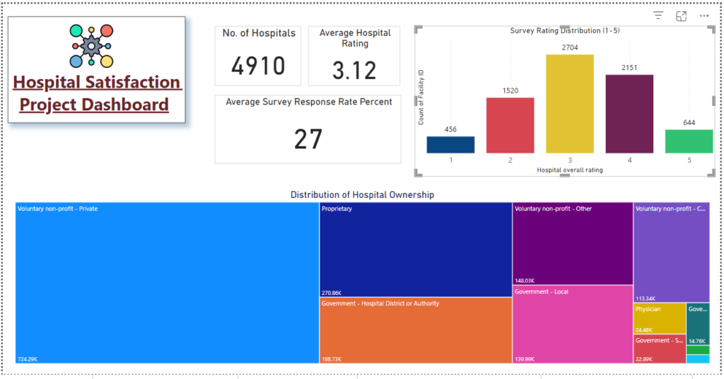
Above is a breakdown of how the hospitals in the United States. This dashboard gives viewers an overview of the data set with the following metrics:
- Number of hospitals – 4,910
- Average Hospital rating – 3.12 / 5
- Average Survey Response Rate – 27%
The dashboard also provides information on the distribution of survey ratings for the hospitals in the dataset. 3-star ratings are the most populous with 2,704 and it is in keeping with the average hospital rating.
The treemap visual also shows that voluntary non-profit-private hospitals are the most owned in the United States.
General Facility Overview
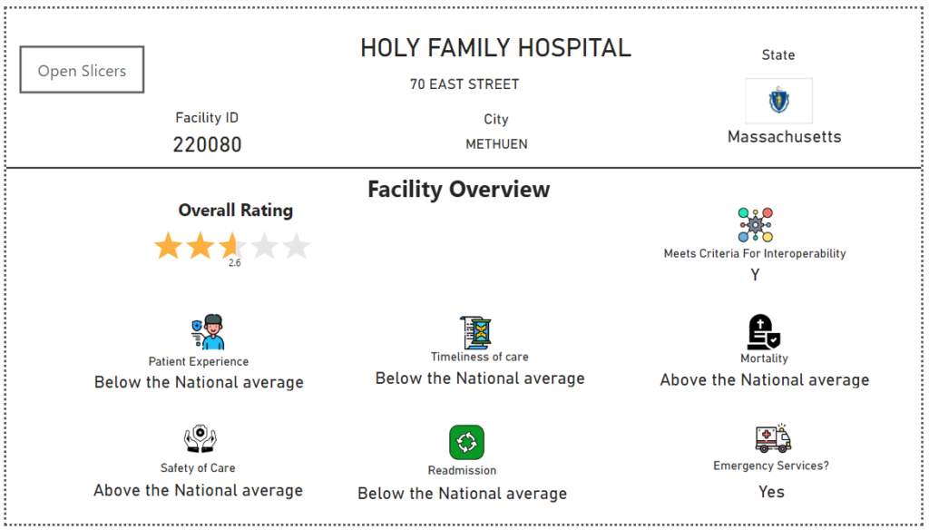
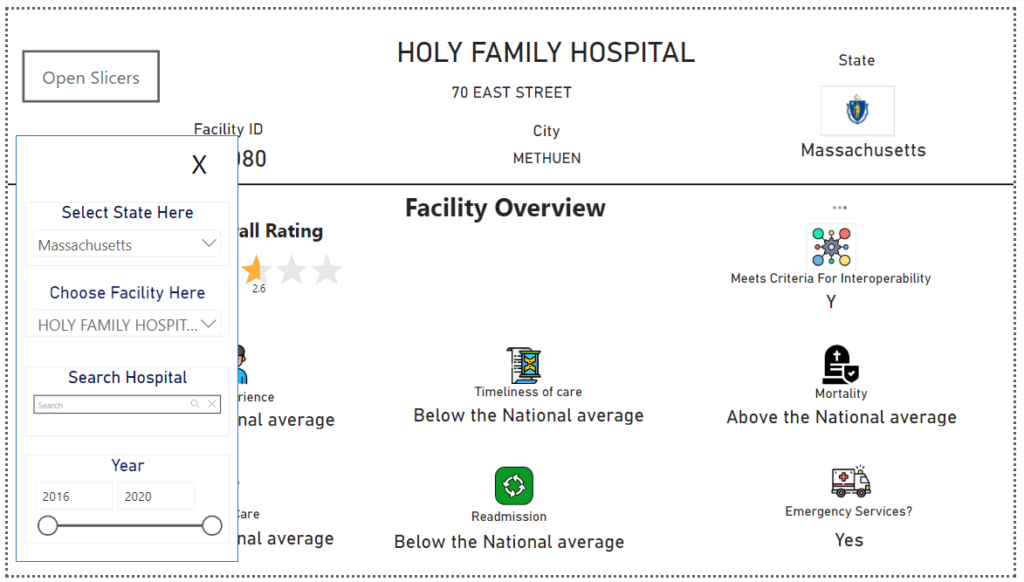
This collection of visuals is made of card visuals that have all been manipulated and synced to perform specific functions in telling a cohesive data story.
Some important visual manipulations made to these visuals include:
- Changing star rating visuals to sync with the chosen hospital
- State logos to indicate the chosen state
- Slicers to choose specific data points to have a look at
Here is what the slicer open button reveals:
How Are Facilities Distributed Around The United States
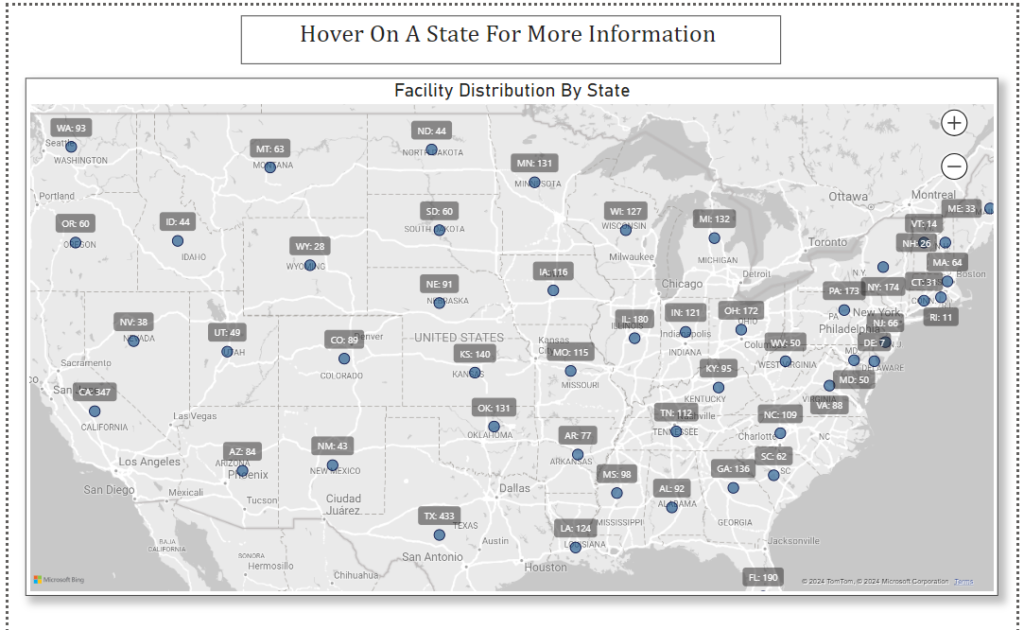
This map visually properly represents the distributed number of hospitals in each state in the United States.
Average Hospitals Ratings By State
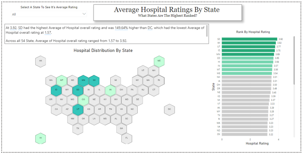
The above visual is a synoptic panel showing the color-graded distribution of ratings around states in the United States.
The deep-green colored states (the top 5 states) have the highest ratings and the stacked bar chart beside the map correlates with this.
Insights: At 3.92, South Dakota had the highest Average Hospital overall rating and was 149.64% higher than DC, which had the lowest Average Hospital overall rating at 1.57.
Across all 54 States, the Average Hospital overall rating ranged from 1.57 to 3.92.
Trends Across The Star Ratings
Readmission and Mortality National Comparison
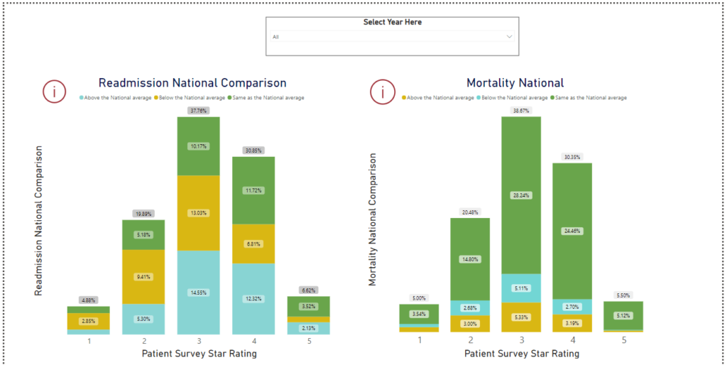
Insights from the Readmission National Comparison visual:
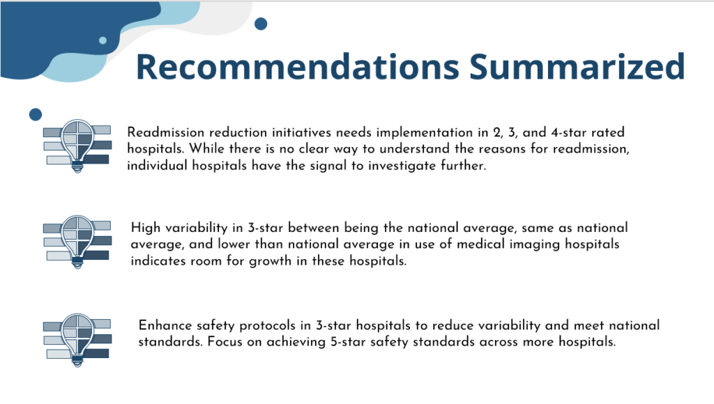
- Hospitals with 3 and 4-star ratings show variability in readmission rates, with a notable percentage performing below the national average (14.55% for 3-stars and 12.32% for 4-stars
- Patient satisfaction does not always align with readmission rates; some highly-rated hospitals still have readmission challenges, while some lower-rated hospitals excel in readmission metrics
Insights from the Mortality National Comparison visual:
- Most hospitals, particularly those with 3 and 4-star ratings, have mortality rates close to the national average regardless of survey ratings.
- Since most hospitals fall within mid-range ratings, quality improvement efforts should focus on these groups to boost patient satisfaction and clinical outcomes.
Effectiveness and Safety of Care
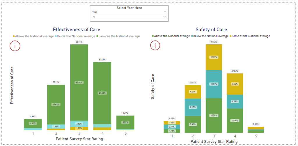
Insights from the effectiveness of care visual:
- The majority of hospitals across all-star ratings fall into the “Same as the National average” category, indicating that many hospitals perform consistently with national care standards.
Insights from the safety of care visual:
- Hospitals with 2 and 3 stars show a relatively balanced distribution of performance, with nearly equal parts above and below the national average.
Effective Use of Medical Imaging
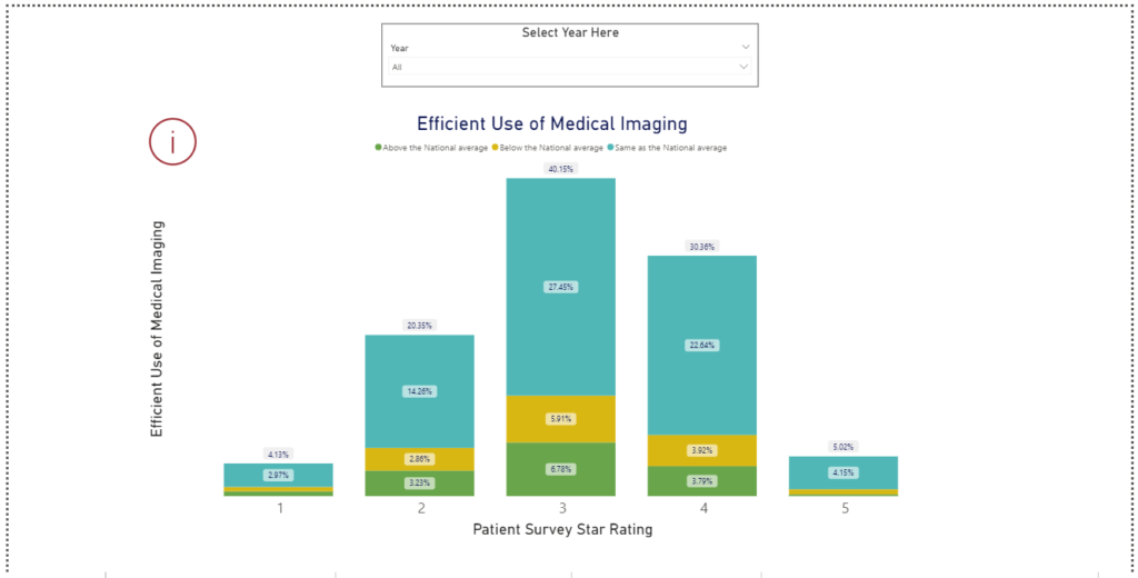
Insights from the effective use of medical imaging visual:
- Hospitals with higher patient survey ratings (3 to 5 stars) tend to perform at or above the national average in the efficient use of medical imaging, indicating a positive correlation between patient satisfaction and operational efficiency.
Average Hospital Rating Exploration
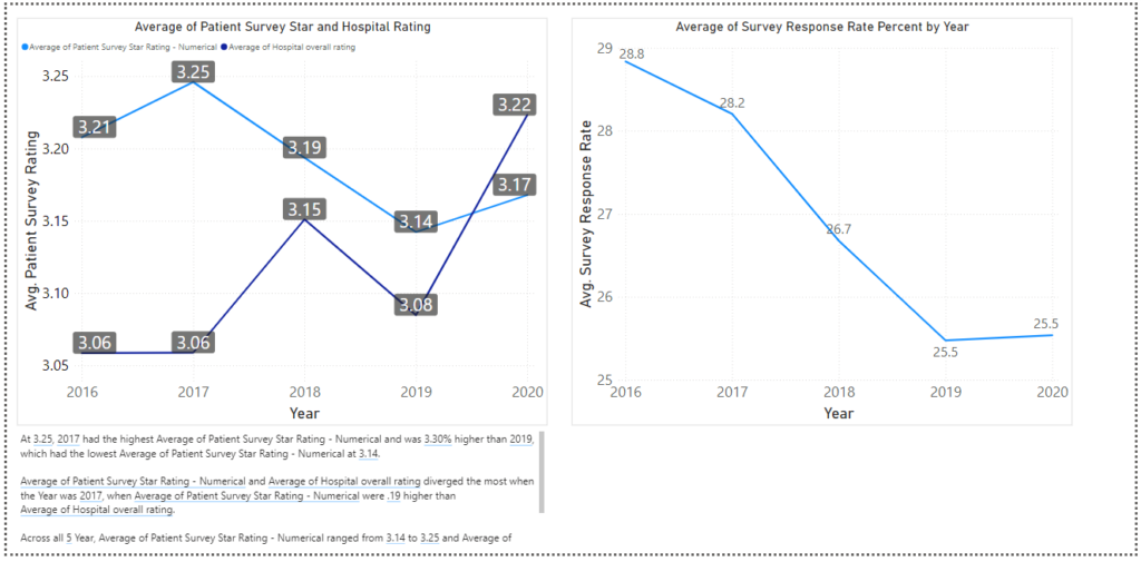
Insights from the average hospital rating visuals
- At 3.25, 2017 had the highest Average of Patient Survey Star Rating – Numerical and was 3.30% higher than 2019, which had the lowest Average of Patient Survey Star Rating – Numerical at 3.14.
- The average Patient Survey Star Rating – Numerical and the Average Hospital overall rating diverged the most when the Year was 2017 when the Average Patient Survey Star Rating – Numerical was 0.19 higher than the Average Hospital overall rating.
- Across all 5 Years, the Average Patient Survey Star Rating – Numerical ranged from 3.14 to 3.25 and the Average Hospital overall rating ranged from 3.06 to 3.22.
- Between 2016 and 2020, the average survey response rate has seen a steady decline – this may be what the hospital agencies may need to look into.
Relationship Between Hospital Rating and Hospital Ownership

Insights:
- At 3.81, Physician-owned hospitals had the highest Average Hospital overall rating and were 43.83% higher than Government – Federal, which had the lowest Average of Hospital overall rating at 2.65.
- Across all 10 Hospital Ownership, the Average Hospital overall rating ranged from 2.65 to 3.81.
State-Level Visuals
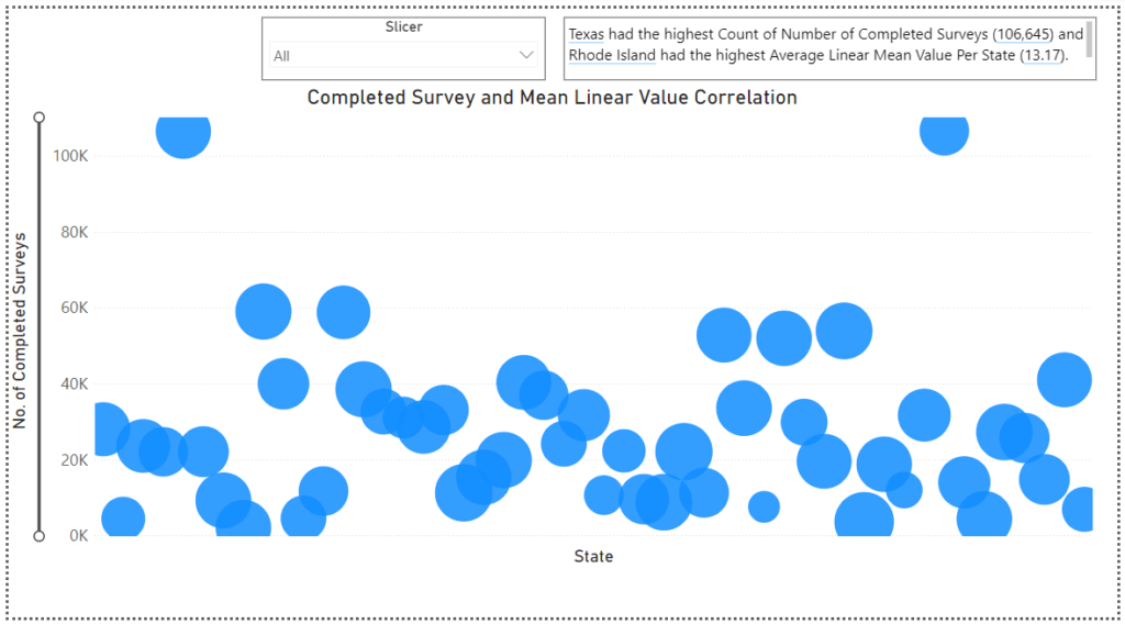
Insights from the visual:
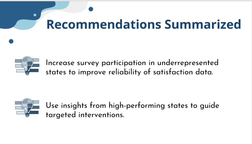
Texas had the highest Count of Number of Completed Surveys (106,645) and Rhode Island had the highest Average Linear Mean Value Per State (13.17).
Average Survey Response Rate By State
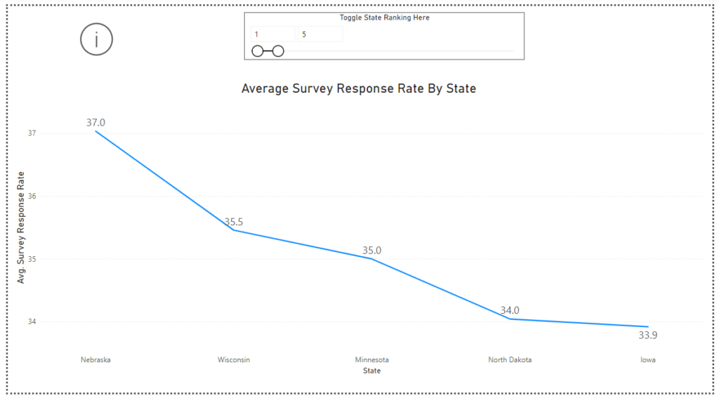
Insights from the visual:
- At 37.03, Nebraska had the highest Survey Response Rate and was 76.87% higher than New Mexico, which had the lowest Survey Response Rate at 20.94. Across all 50 States, the Survey Response Rate ranged from 20.94 to 37.03.
Hospital Ownership Distribution By State
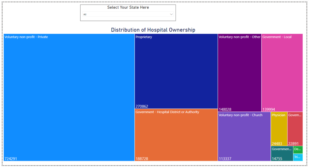
The above visual shows the numerical distribution of hospitals around the United States. The size of the rectangle shows how many of a specific hospital are located in the United States. Each hospital type is represented by a different color.
Viewers can also choose specific states to understand the distribution of hospitals in that state.
Radial Linear Mean Distribution
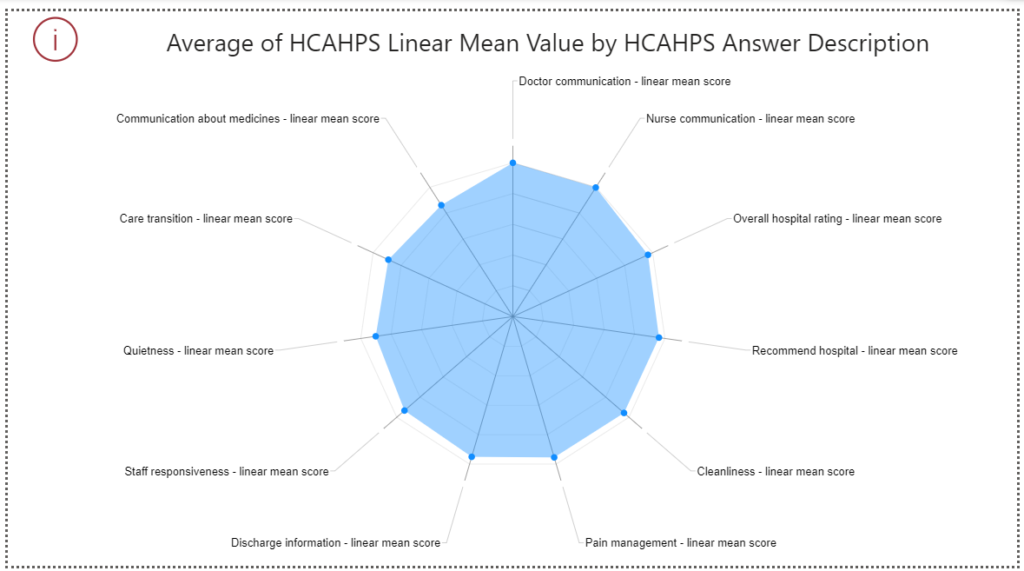
Insights From The Visual
Hospitals perform respectable well in most areas like recommendation, cleanliness, discharge information, and staff responsiveness. However, it needs improvement in metrics such as “Pain management” and “Overall hospital rating.”
State Rating Trends Over Five Years
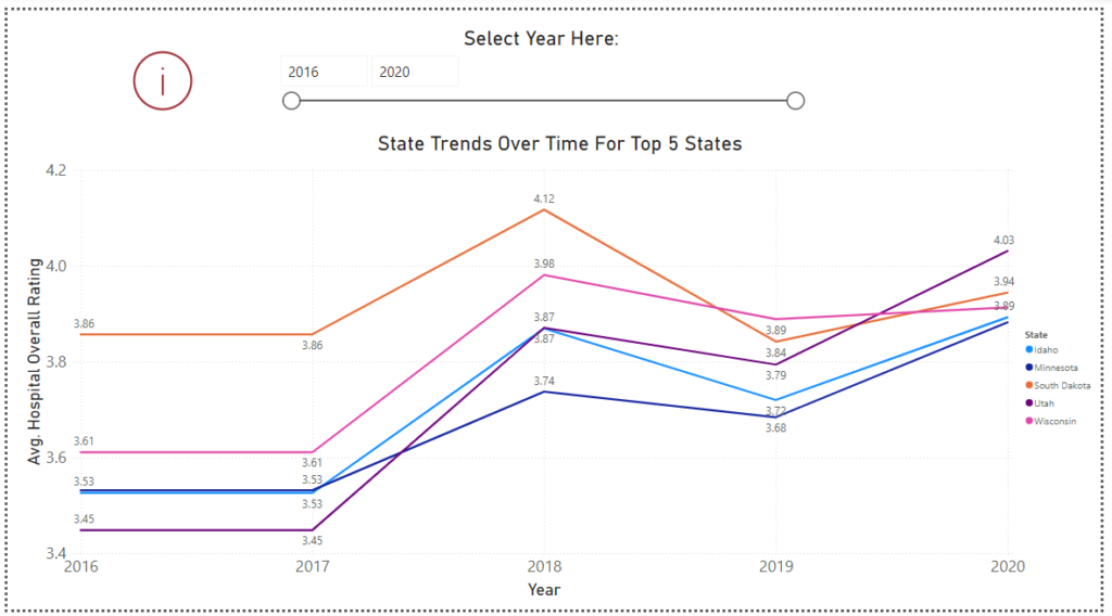
Insights From The Visual
The states have their lowest ratings at the time of the data collection – 2016. Hospitals recorded their peak in 2018 with South Dakota posting the highest rating at this point of 4.12 and there is a significant leap for other facilities as well. After high recorded ratings, most hospitals saw a dip with Minnesota showing the best recovery after the 2019 dip in 2020.
